Trade Union JHL has a new visual look
Trade Union JHL has today adopted a new, fresh visual look. It supports JHL’s strategy as strong, caring and most influential one of trade unions.
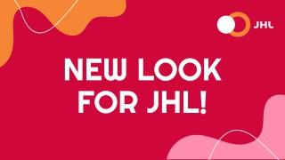
The Trade Union for the Public and Welfare Sectors JHL has launched its new, cheerful look.
– The new look reflects how fresh, strong and caring Trade Union JHL is. It still has the old recognisable JHL logo and the red and orange colours, but the new elements and additional colours make it modern and impressive, JHL’s Communications Manager Kristiina Ahonen states.
The purpose of the reform has been to unify JHL’s look in which there has been a great deal of variety over the years as a result of adopting various visual designs. The new look is based on two already familiar main colours – orange and red – and on a family of fonts and a few additional colours. This whole is clear and recognisable while offering enough possibilities to keep the look constantly fresh.
The new look has been drafted in cooperation with advertising agency RED Helsinki. From this day onwards, it can be seen in all of JHL’s channels. Our website will be updated with the look during this spring’s website reform. Later on, we will give more information about this reform and its timetable.
To learn more about JHL’s new look, check out the graphic guidelines (in Finnish) in JHL’s material bank.
More information: Communications Manager Kristiina Ahonen 040 530 1774